AN IDLER STUDIO
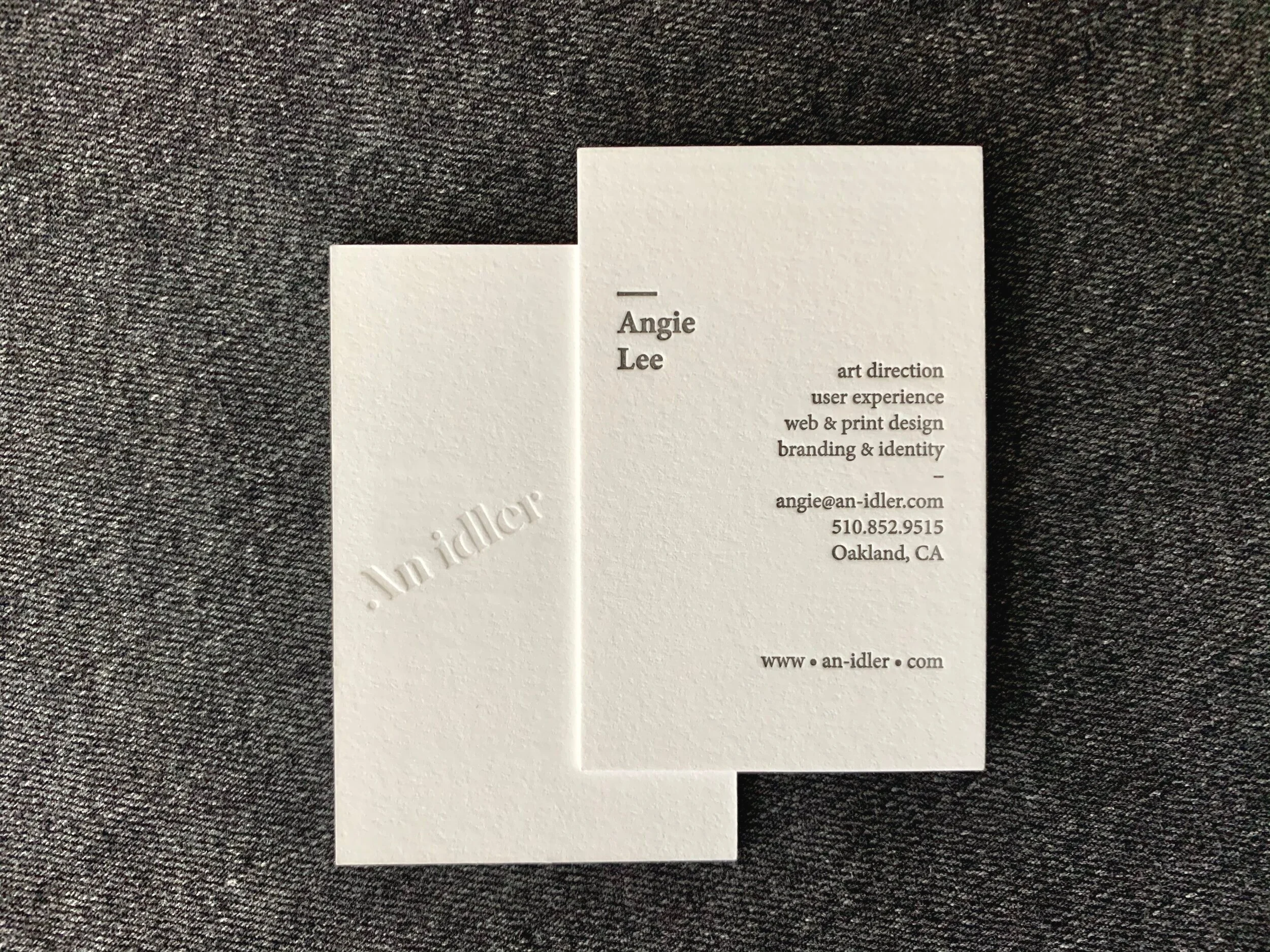
A logotype designed for AN IDLER STUDIO.
AN IDLER was formed after the book How to Be Idle. The idea of being idle — to leave more space for discovery, which result a better design and better solution. Taking this notion into the design, the logotype was tilted 27 degree to create space from underneath, while anchored to the vertical plane by creating parallel line with the character A. The typeface adds a quietness quality to the personality of the brand.
Website
Client: AN IDLER STUDIO / Platform: Squarespace


